
Don Papa Rum – MassKara
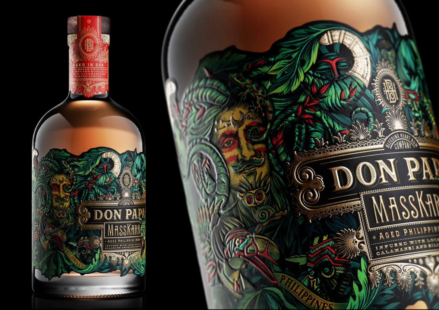
Don Papa MassKara is steeped in the riot of colour and detail of the Philippines’ iconic MassKara Festival. The brief: carry that intricacy through to print without losing a line of it.
The Challenge
The challenge was to build an embossing spec dense enough to match the artwork’s intricacy without losing definition or muddying the design when pressed into the substrate.
The Approach
I hand-developed a full embossing plate directly from the main illustration, isolating hero creatures and elements within the composition, with the wordmark, banner and central crest kept clean. The embossing was built to work with the pearlescent substrate, catching and shifting light for a dimensional, almost animated quality – paired with Kurz Luxor foil and a full CMYK process build to carry the artwork’s intensity through to print.
The Result
A label where the embossing tells as much of the story as the illustration itself. The pearlescent stock amplifies every contour, delivering a pack that feels genuinely celebratory and tactile in the hand.