
Isle of Harris Gin
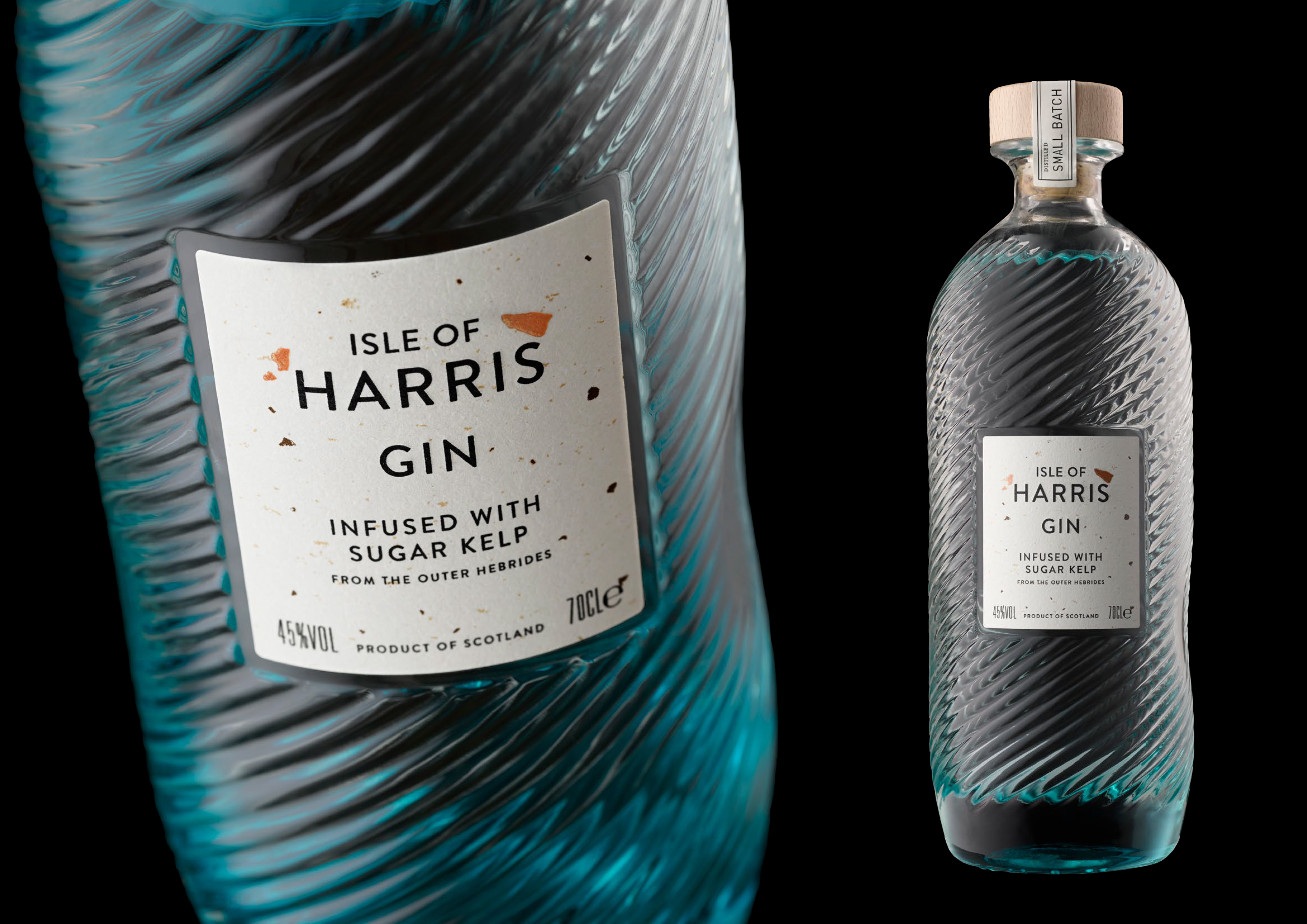
Isle of Harris Gin is infused with hand-harvested sugar kelp from the Outer Hebrides. The brief called for a label that told the sourcing story before a word was read – a paper as authentic and native to the island as the botanical inside the bottle.
The Challenge
Often, the simplest designs present the most interesting challenges. Isle of Harris Gin is infused with hand-harvested sugar kelp, and the label had to carry that provenance in its material, not just its messaging – an organic, tactile surface that could still hold fine typography and premium finishing.
The Approach
I developed a bespoke paper texture by scanning the actual sugar kelp used in the gin’s production, translating its organic flecks and fibrous structure into a printable background built from CMYK process inks, with a metallic pigment reserved exclusively for the copper flecks. No two labels read quite the same. This was paired with matt black foil and precision embossing to bring weight and contrast to the typography against the paper’s natural, mottled surface.
The Result
A label system that carries genuine provenance in its material, not just its messaging – the copper flecks and organic texture of real Hebridean kelp visible in every bottle, reinforcing the brand’s story through touch as much as through design.