
Bertolli Olive Oil – Global Packaging Rebrand
Deoleo's largest-ever rebrand: one global design across every market, still locally relevant in each – with 160 years of heritage intact.
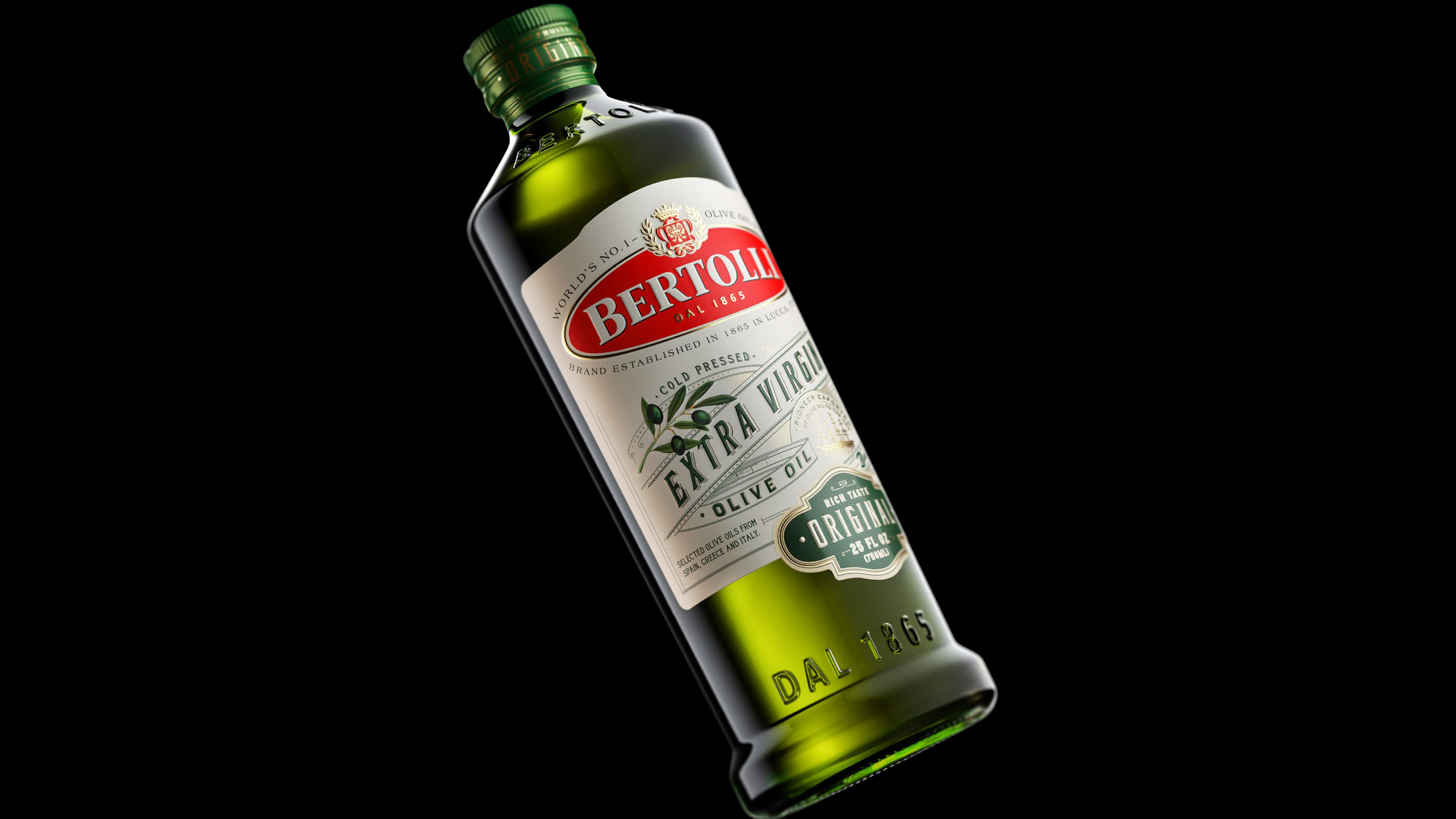
The Challenge
Bertolli has sold olive oil since 1865, when Francesco and Caterina Bertolli started from a shop in Lucca. Deoleo's largest-ever rebrand had to do two things that usually pull apart: one global design across every market, still locally relevant in each. VP of Marketing Fernando Herrera called it a top priority for 18 months. The brief to Stranger & Stranger: modern but authentic, heritage intact.
The Process
Two things the brand already owned drove the work: its origin in Lucca and its history of firsts (glass bottles in the 1950s, health benefits on-label, flavoured oils to the US). The oval carried through the whole system. The logo already held the shape, so it stayed. A cartouche at the base flagged variety on three of the six SKUs (Delicate, Original, Mild). We lifted the label material and finishing to a level olive oil hadn't seen, closer to premium spirits than grocery, raising the perceived quality of the whole pack.
The Result
A bottle you read as Bertolli from across the aisle, before a word registers. Embossed shoulder, light-protecting dark glass, Lucca-derived form, premium finishing, all through high-volume manufacture without losing the feel that justified the job.