
The Kraken
My role: production design & brand asset management, completed whilst at Stranger & Stranger.
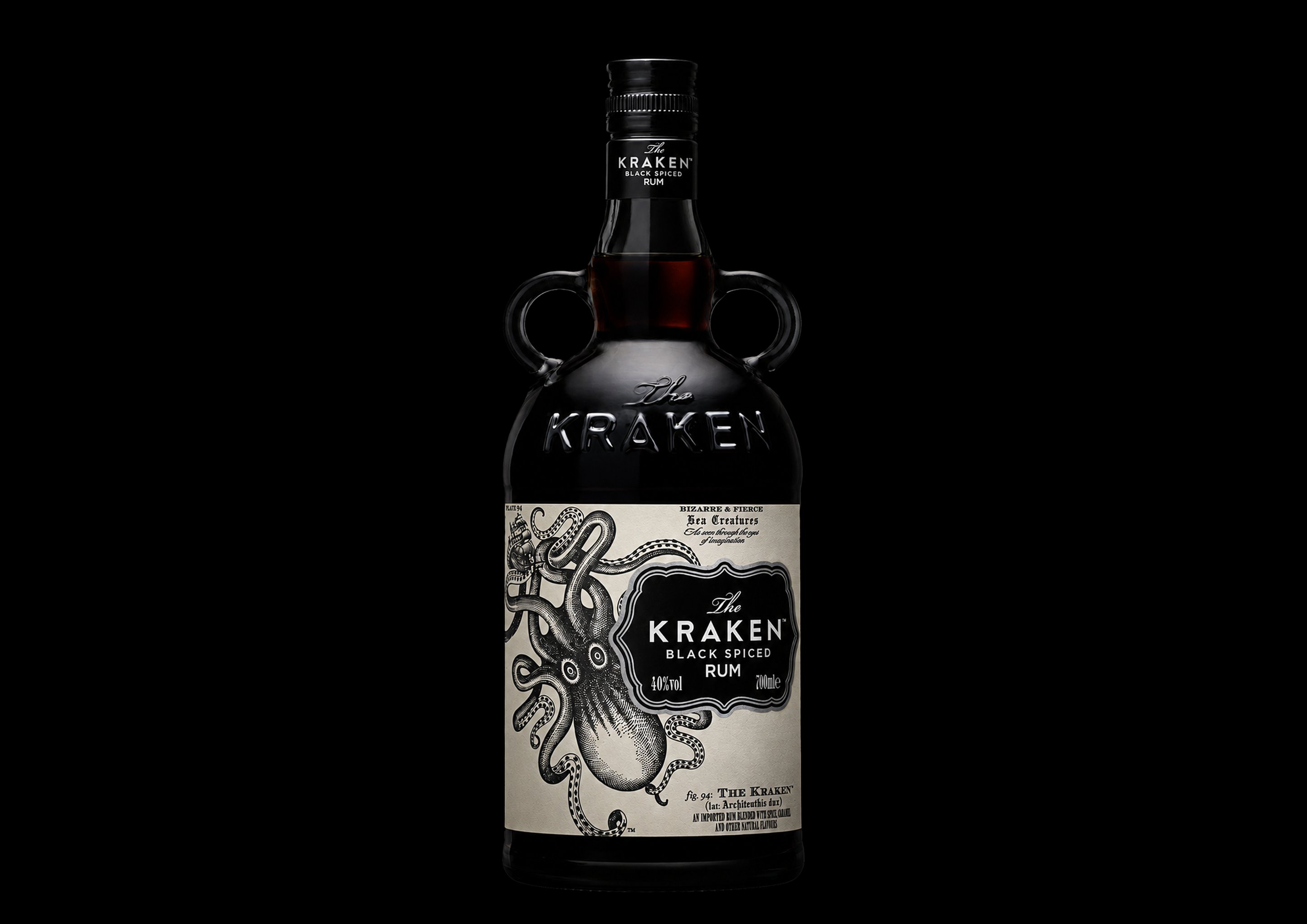
The Kraken’s core range is the brand’s most recognisable pack – the embossed apothecary bottle with its twin handles. The work was carrying that single design across every bottle size, its primary and secondary packaging, and a widening set of touchpoints that all had to match.
The Challenge
A single pack design had to hold across a full range of bottle sizes and formats, along with the secondary packs and point-of-sale that travelled with them. The more formats a brand runs, the easier it is for each one to drift a little further from the last.
The Approach
The design was managed format by format rather than scaled from one master, so every size and pack type was set up correctly in its own right. Primary and secondary packs were kept aligned throughout, with a maintained set of approved brand assets as the reference for every new application.
The Result
The range reads as one brand across every size and format, and later applications stayed consistent as the brand extended – without rebuilding the artwork each time.